2021
How you should be sending every email in your business
We all send out 100’s of emails from our business every
week if not every day. Each one of these emails is a touch point with
your market be it direct or indirect.&...
 What Is Responsive Design – Simply Explained
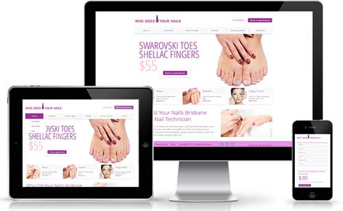
 There is no doubt that responsive design websites has been firmly established as the best way to deliver mobile compatible websites. But what is this really mean that the non-technically inclined people who want these sites? We offer this simple explanation which will help you understand what it means.
Quite simply, responsive layouts are the means by which we take that same content you see on the desktop version of your website and then presented on the different mobile devices. It is based on using a single set of content and should not be confused with presenting alternate content for mobile devices which is quite a different matter.
Imagine if you will, you have a collection of photos and sticky notes all laid out to fill and A3 size piece of paper. Now take an A4 page, folded in half and try to place those same photos and sticky notes (all of different size and orientation) onto the folded piece of paper being A5 size.
They just don't fit! Well, that's our problem with putting your website onto mobile devices.
Now we can reduce the size of some of those photos and sticky notes which is exactly what happens with your website now. Everything is shrunk to fit into
the page. Problem is, we can read a text or see the images. We also find that some are off the page so we had to scroll up, down and sideways to bring
them in to view.
Not a pleasant experience so unless you are very determined, you generally give up.
With a responsive layout we address the following key aspects:
If you haven't noticed it yet, responsive layouts for websites are becoming an additional design activity all of their own.
Whilst smaller websites and those with simple page content layouts are not so much of a problem, creating responsive layouts for many new websites requires considerable thought and planning as these invariably a more complex in design.
All responsive designs are based on the use of a standard grid layout. This is used position those elements in your page in a consistent manner best suited for presenting on different devices.
There are unofficial standard grid systems such as 12 column or 960 grid commonly used with the most common, Twitter bootstrap, been adopted by most developers. There are a few others also commonly used but all of them share the same principles of design.
It is essential that any responsive design uses such a grid system with accompanying style coats to control how content is displayed in the different device browsers.
My point above about using a grid system for your responsive design is critical. The problem is most websites have not been designed utilising any such group system and certainly all the style coats (these are the CSS stylesheets) will not be set up for mobile devices.
The long and short all is that you can't simply "convert" a non-responsive site to a responsive design. You have to redesign site template and page layouts and then rebuild it will.
It is in fact not only easier, but more efficient to build your site again from scratch that is to retrofit responsive designs and styles to an existing set of code.
In the long run, you can't avoid this decision. With the growing use of mobile devices used to view websites and with the distinct SEM advantages that come from a mobile compatible version, you'll need to address this one-day.
As to when you should provide mobile compatible versions of your websites will be determined by your mark. You can monitor the level of mobile viewers of your site through Google analytics which is your best guide.
On the one hand yes as well. We are finding that as a general guide, responsive solutions can be an average of 30% increase on costs. On more complex science this can be higher.
On the other hand, your website is probably due to an update stop because of standards being somewhat adopted and with tools such as Twitter bootstrap, a certain amount of development and ongoing support costs are reduced. You will also find that your new site will include many improved user interface design features that will improve the experience visitors and engagement with them. This all should lead to improve conversion as your previous website.
Top Left Designs now delivers the option of responsive design to its clients. To ensure a wider appeal and reduced ongoing maintenance costs, we back to a responsive designed by default, but of course still offer quality non-responsive solutions. If you would like to look at moving your own website to a mobile compatible platform through responsive design, please contact us and we can outline what would be involved.
https://www.topleftdesigns.com.au/my-assets/img/blogs/responsive-design-layout.jpg
300 300
Written by: Greg Tomkins
 on
on
 https://www.topleftdesigns.com.au/_Assets/images/topleftdesigns_logo_h.jpg
379 118
https://www.topleftdesigns.com.au/_Assets/images/topleftdesigns_logo_h.jpg
379 118
We all send out 100’s of emails from our business every
week if not every day. Each one of these emails is a touch point with
your market be it direct or indirect.&...
There is no secret in the fact that in order to achieve success and grow your business, it is essential to have systems in place founded on sound business processes.
Business leaders...
I always say that there is no better way to provide a product and having used yourself first.Only then can you relate to the experience your customers will go through themselves.
Bef...
Back in 1999 I worked with a number of companies performing Y2K Audits for SME businesses and now I find that we are facing an even bigger threat. According to Damian Seaton of Read more
Right now the Queensland Government is just opened up Round 4 of its Small Business Digital Grants Program offering up to $10,000 towards the cost of purchasing hardware, software and servic...