2021
How you should be sending every email in your business
We all send out 100’s of emails from our business every
week if not every day. Each one of these emails is a touch point with
your market be it direct or indirect.&...
 Responsive E-Mails for Mobile Devices
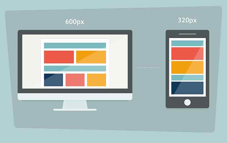
 Just as the market is ever more browsing websites on mobile devices, so too is the level of e-mail usage on mobile devices increasing. In this article we examine what this means to you and how you communicate with your market.
It is imperative that website owners give consideration to the compatibility of the website across the range of mobile devices. The solution most often taken up by Web developers is by delivering responsive website designs. For much the same reasons, the same website owners should be giving consideration to the devices being used by their market for reading e-mails.
To date, relatively little attention has been given to this area but certainly it should not be ignored. Looking at the numbers in our Infographic, in we see the light websites, and ever-increasing share of the market is reading in our on mobile devices. The data presented however is not showing what percentage of those e-mails read on a mobile device read more fully on a desktop computer at a later point.
Your Web developer will need to define your layouts as the coding requirements are the same as we use in designing responsive web pages.
Essentially we have defined screen width to reach device and we need to arrange the information elements to fit within that width. Sometimes this also involves changing the order in which they are displayed. the websites we do this through CSS code to set the style attributes. The CSS style code is either herald in external files that are loaded (this is for website pages only) or embedded within your page or e-mail.
Styling and laying out e-mails has always presented its challenges. These are further exasperated if you are trying to build a responsive e-mail layout.
The problem lies in the e-mail client used to read the e-mail. Have you ever noticed our e-mails present differently in outlook to save Google mail? It’s the same content – however each e-mail client handles that content differently.
Some e-mail clients without any embedded CSS file definitions only allowing "in line". The other problem is that different e-mail clients will handle "in line" style or embedded styles differently recognising some CSS code but not other code.
The end result is that it is a long and complex exercise design e-mail templates to work across all e-mail clients consistently and in a manner that is relatively easy for users to edit the content. To achieve the same with responsive e-mail designs is even more difficult.
Check your analytics first. Work with real numbers determining what share of your market relies on mobile e-mail. Find out what e-mail clients your contacts predominantly use as this can also assist your decision. Finally, look at how easily you can set up responsive e-mail designs in your mass mail system, including how easily you can edit your e-mail content.
There are a number of e-mail testing solutions which will verify how well your e-mail works on different e-mail clients. Of course you can always do some simple testing yourself on your desktop, Gmail, iPad and iPhone to give you an early understand.
https://www.topleftdesigns.com.au/my-assets/img/blogs/responsive-email-design.jpg
300 300
Written by: Greg Tomkins
 on
on
 https://www.topleftdesigns.com.au/_Assets/images/topleftdesigns_logo_h.jpg
379 118
https://www.topleftdesigns.com.au/_Assets/images/topleftdesigns_logo_h.jpg
379 118
We all send out 100’s of emails from our business every
week if not every day. Each one of these emails is a touch point with
your market be it direct or indirect.&...
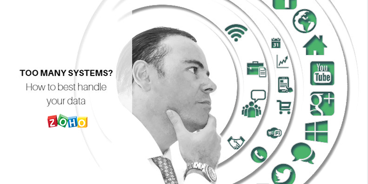
There is no secret in the fact that in order to achieve success and grow your business, it is essential to have systems in place founded on sound business processes.
Business leaders...
I always say that there is no better way to provide a product and having used yourself first.Only then can you relate to the experience your customers will go through themselves.
Bef...
Back in 1999 I worked with a number of companies performing Y2K Audits for SME businesses and now I find that we are facing an even bigger threat. According to Damian Seaton of Read more
Right now the Queensland Government is just opened up Round 4 of its Small Business Digital Grants Program offering up to $10,000 towards the cost of purchasing hardware, software and servic...