2021
How you should be sending every email in your business
We all send out 100’s of emails from our business every
week if not every day. Each one of these emails is a touch point with
your market be it direct or indirect.&...
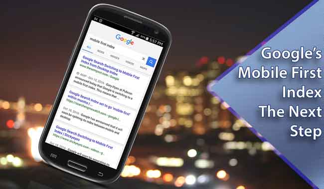 Google to swap over to mobile first index in coming months and what it means
 You may not have noticed it or even understood what this announcement really means but we feel that this is likely to have the biggest impact on non mobile-friendly websites out of all the updates and changes Google has announced since we first heard about "mobilegeddon" last year. Believe us when we say, if your website is not mobile friendly then expect serious loss of Google rank position for your site across all search terms.
As we mentioned, in 2015 Google decreed that all websites had to go mobile-friendly or face serious loss of ranking. A good number of websites complied and over the next 12 months we have seen many move to responsive design base enabling their sites to be visible and usable across all devices compliant with the UI design standards. If you are not sure whether your site is deemed as being mobile-friendly then Google provides a tool that quickly analyses your site for compliance (https://www.google.com.au/webmasters/tools/mobile-friendly/). If you don't pass this then you need to get your site responsive or compliant with mobile UI standards.
Late last year we started hearing about AMP's (Accelerated Mobile Pages) which is all about using mobile optimised code for presenting content. We have also been hearing a lot more abut the importance of web PageSpeed. Again, Google have been good enough to provide a tool (https://developers.google.com/speed/pagespeed/insights/) however this tool does not always give the clearest results so we recommend a free tool called GTMetrix which runs to analysis tools and provides indepth analysis of your page.
The third contributing factor is that Google stated that on mobile devices, mobile-friendly sites would get precedence on mobile searches over non-compliant sites. Initially the search results even marked such sites as being mobile freindly to separate them from the other sites but this has now been dropped.
SO we have had these 2 key factors pushing us to mobile-friendly websites that are efficiently loaded into your favourite browser to view and giving precedence to mobile-friendly sites in the search results.
Well this is where it has all been leading to - Google's master plan. In keeping this very simple, Google creates an "index" of all the website pages it finds with its "bots". Up until now there has been a single index that contained entries for both mobile and not mobile-friendly website pages. Based on what sort of device yu were working from it would present different results giving mobile friendly site precedence over non-friendly sites in mobile based searches. Last year Google announced that it was "experimenting" wit the idea of a mobile index and has been moving toward that ever since.
The idea of having separate indexes was bound to come to an end and on the 18th October 2016 Google's Gary Illyes, a Google webmaster trend analyst with Google informed everyone at the Pubcon that Google will create a separate mobile index within months that will be the main or "primary" index and whilst there will still be a desktop index it has been suggested that this will not be kept as up to-date as the mobile index.
The most substantial change will likely be that by having a mobile index, Google can run its ranking algorithm in a different fashion across “pure” mobile content rather than the current system that extracts data from desktop content to determine mobile rankings. This we see as being part of moving toward AMP's as the new standard.
It would appear that the common belief is that eventually the desktop index will be scaled back and dropped.
The days of getting away with a website that is not mobile-friendly are now very much limited and for anyone that does not have a mobile-friendly site now needs to move on updating their website immediately.
What this all really means to web designer in the broader context remains to be seen with implications of what content within a page gets displayed on mobile devices as opposed to desktops and even which pages are navigable on mobile devices. Questions also still need to be asked about the effectiveness of 'm.' or 'mobile' sub domains that some sites use to present mobile only versions of their websites - generally these are cut down versions of the overall site with their own site structure map, separate content within pages and fixed layouts that work on a smartphone but not using any underlying responsive framework. This is more the concern of larger website with several hundred pages (most of which does not really nee to be available to any visitor on a smartphone).
https://www.topleftdesigns.com.au/my-assets/img/blogs/mobile-first-index.jpg
300 300
Written by: Greg Tomkins
 on
on
 https://www.topleftdesigns.com.au/_Assets/images/topleftdesigns_logo_h.jpg
379 118
https://www.topleftdesigns.com.au/_Assets/images/topleftdesigns_logo_h.jpg
379 118
We all send out 100’s of emails from our business every
week if not every day. Each one of these emails is a touch point with
your market be it direct or indirect.&...
There is no secret in the fact that in order to achieve success and grow your business, it is essential to have systems in place founded on sound business processes.
Business leaders...
I always say that there is no better way to provide a product and having used yourself first.Only then can you relate to the experience your customers will go through themselves.
Bef...
Back in 1999 I worked with a number of companies performing Y2K Audits for SME businesses and now I find that we are facing an even bigger threat. According to Damian Seaton of Read more
Right now the Queensland Government is just opened up Round 4 of its Small Business Digital Grants Program offering up to $10,000 towards the cost of purchasing hardware, software and servic...